Visualizing 27 years of mobile devices
Device ownership has come a long way over the years. Smart devices are more personal than ever with a sizable chunk of the modern population having owning at least a smart phone. It's no exaggeration to say that smart devices that are pretty much ubiquitous in our modern society. However what's even more interesting is the rate at which they've evolved over the past 2 decades.
For example, consider the following brief comparison between the Huawei Nexus 6p[1] and the Nokia 9000 Communicator[2]
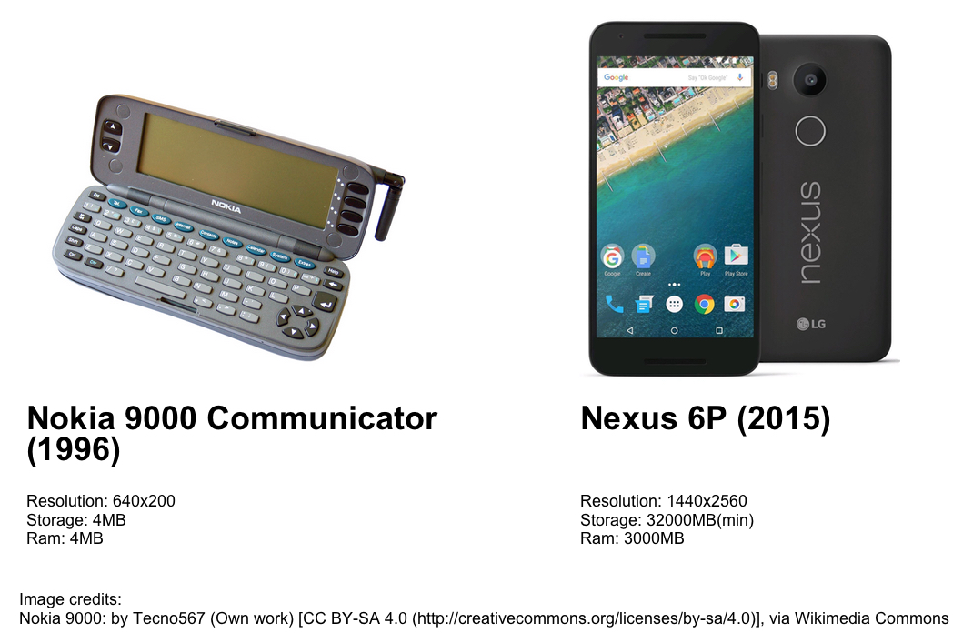
From this extremely simplistic comparison, it's easy to see that in just under 20 years, the number of pixels in the average display increased by 2880%, storage went up at least 800000% and Random Access Memory (RAM) has seen an increase of about 75000%. While this is by no means an exhaustive comparison, the results are still pretty staggering. This motivated me to look further into how our smart devices have changed over time.
Disclaimer: I did the best I could with what I could find. I cannot guarantee the accuracy of any of the data or the results[3]. The data represented here range up to sometime in 2016.
Data acquisition
In order to proceed with my investigation, I needed to acquire data, so after looking into various sources, I settled on PDAdb.net which claims to be
... the World's largest online mobile device database.
and while I have no way of validating their claim, they do have a substantial database of over 9500 devices. Their definition of PDA is also a bit on the broad side as seen in their site description;
...detailed technical specifications of Smartphones, Tablets, Netbooks, PDA devices, PDA phones, PNAs and several kind of handheld/pocket-sized mobile devices running Android, Blackberry, Apple iOS, Windows CE based (Windows Phone, Windows Mobile Pocket PC, Windows Mobile Smartphone, Windows CE.NET, Handheld PC), Symbian based (Series 60, Series 80, Series 90, UIQ, EPOC), WebOS, Linux and other mobile operating systems.
Some may express concerns about the inclusion of Netbooks since those are basically fully fledged computers in very compact bodies. However going by Lenovo's definition[4], they were mostly marketed as being mobile devices complete with CDMA/GSM radios for cellular data access. So, I think it's only fair that they are included.
Scraping for data
In order to conveniently work with the data, I had to scrape it from the site which proved to be rather trivial(not really... ) with the help of the nokogiri and open-uri libraries available as ruby gems.
require 'open-uri'
require 'nokogiri'

PAGE_URL = "http://pdadb.net/m/index.php?m=specs&id="

File.open("data.txt", 'w') do |file|
  (0..9835).each do |count|
    page = Nokogiri::HTML(open(PAGE_URL + count.to_s))

    header = page.css("h2")
    title = header.text.sub "Specifications", ""
    title.strip!

    data = page.css("tr")

    date = ""
    resolution = ""
    data.each{ |chr|
      if chr.text["Display Resolution:"] then
        var = chr.text.sub "Display Resolution:", ""
        date = var.strip
      elsif chr.text["Release Date:"] then
        var = chr.text.sub "Release Date:", ""
        resolution = var.strip
      end
    }

    file.puts "#{count}, #{title}, #{date}, #{resolution}"
    sleep(0.3)
  end
end
I simply iterate over the database by providing the ids of the devices and search the page for the various columns of information I'm interested in. I then write them to a file in the convenient to process CSV format. I add a sleep delay such that I do not overwhelm the service. Generating the plots was done using R and it's fantastic ggplot2 library.
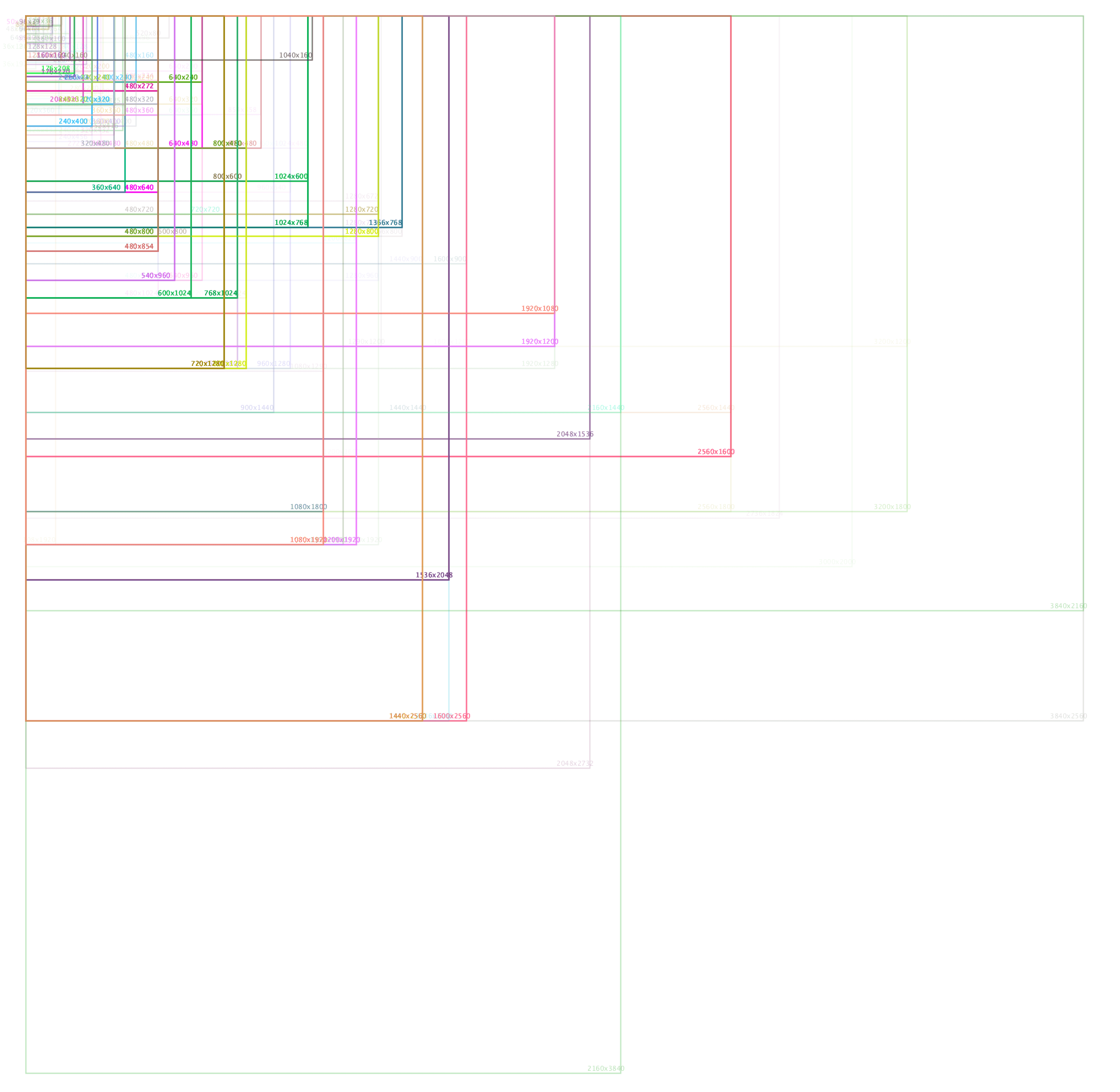
Display resolution
The display/screen resolution refers to the number of pixels in each dimension that can be displayed. Over the years this has grown significantly with displays squeezing in more and more pixels in smaller and smaller form factors.
To visualize this I used the Processing 3 environment. This allowed me to quickly and easily draw the respective sizes on a 4K canvas at a 1:2 scale. This resulted in a massive image which I have cropped to display the relevant data.
Each resolution is assigned a randomly generated color with 20% alpha. So more frequent resolutions appear heavier on the canvas.
mColor = color(random(255), random(255), random(255), 20);
The resulting image is pretty big, at a resolution of 4067x3966, I recommend opening it in a new tab and zooming in for a closer look.
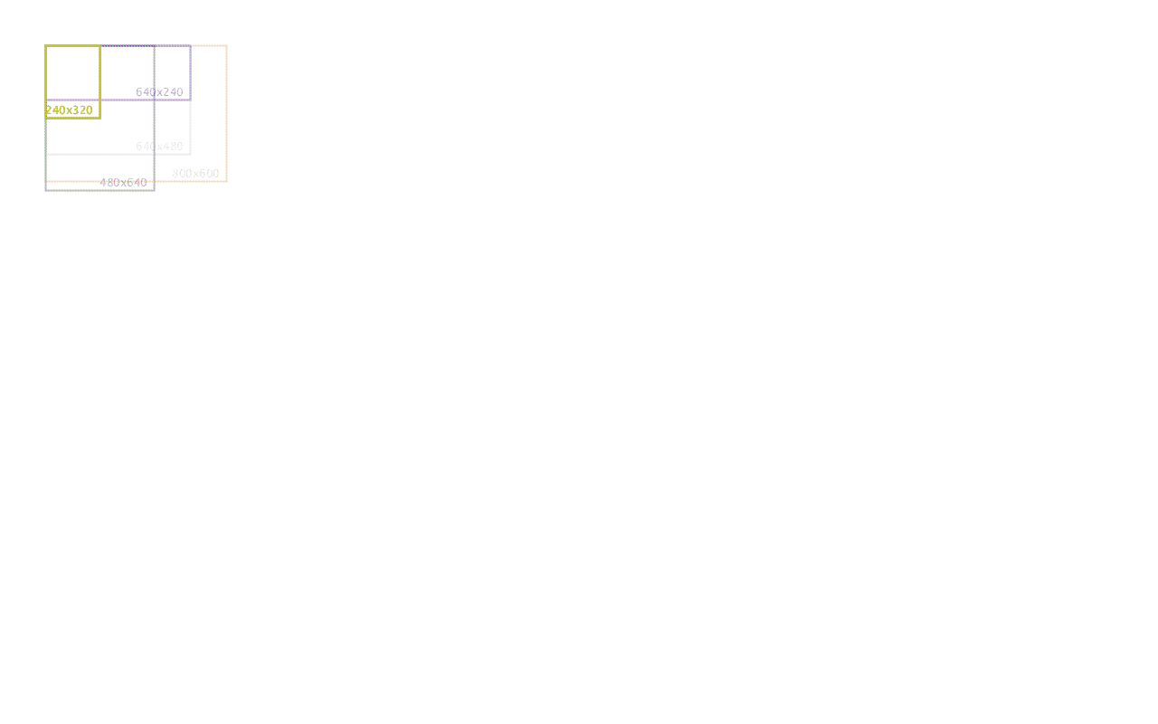
Taking this approach to visualizing the data had the added benefit of delivering this beautiful animation.
Display diagonal
Although this has grown significantly over time with the introduction of full touchscreen devices such as the iPhone. It seems to be that the market has begun to settle at between 5 ~ 6 inches as the average display diagonal.
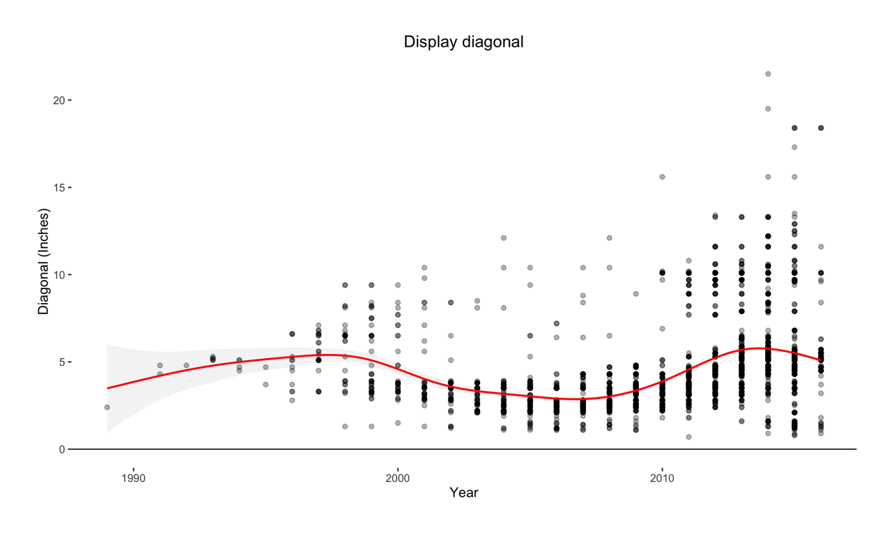
In this plot, we can assume that the extreme outliers are large tablets and netbook devices.
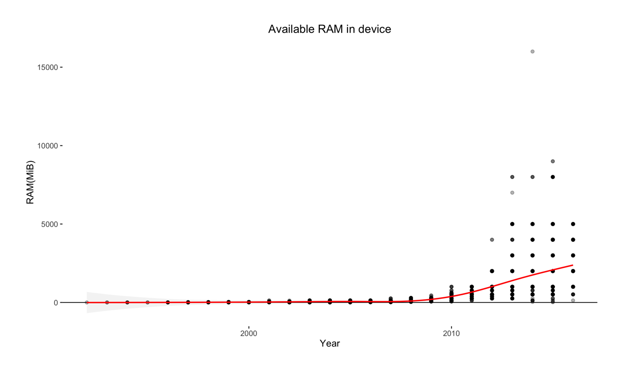
Random Access Memory (RAM)
RAM is fast volatile memory on a device. RAM is considered "random access" because you can access any memory cell directly if you know the row and column that intersect at that cell[5].
It's generally better to have as much ram in your device as possible[6], since it allows your device to keep data right next to the CPU for ready access. So more apps can stay in memory and don't have to be swapped or loaded up. As RAM has become more compact and inexpensive over time we've seen a steady increase as shown by the plot below.
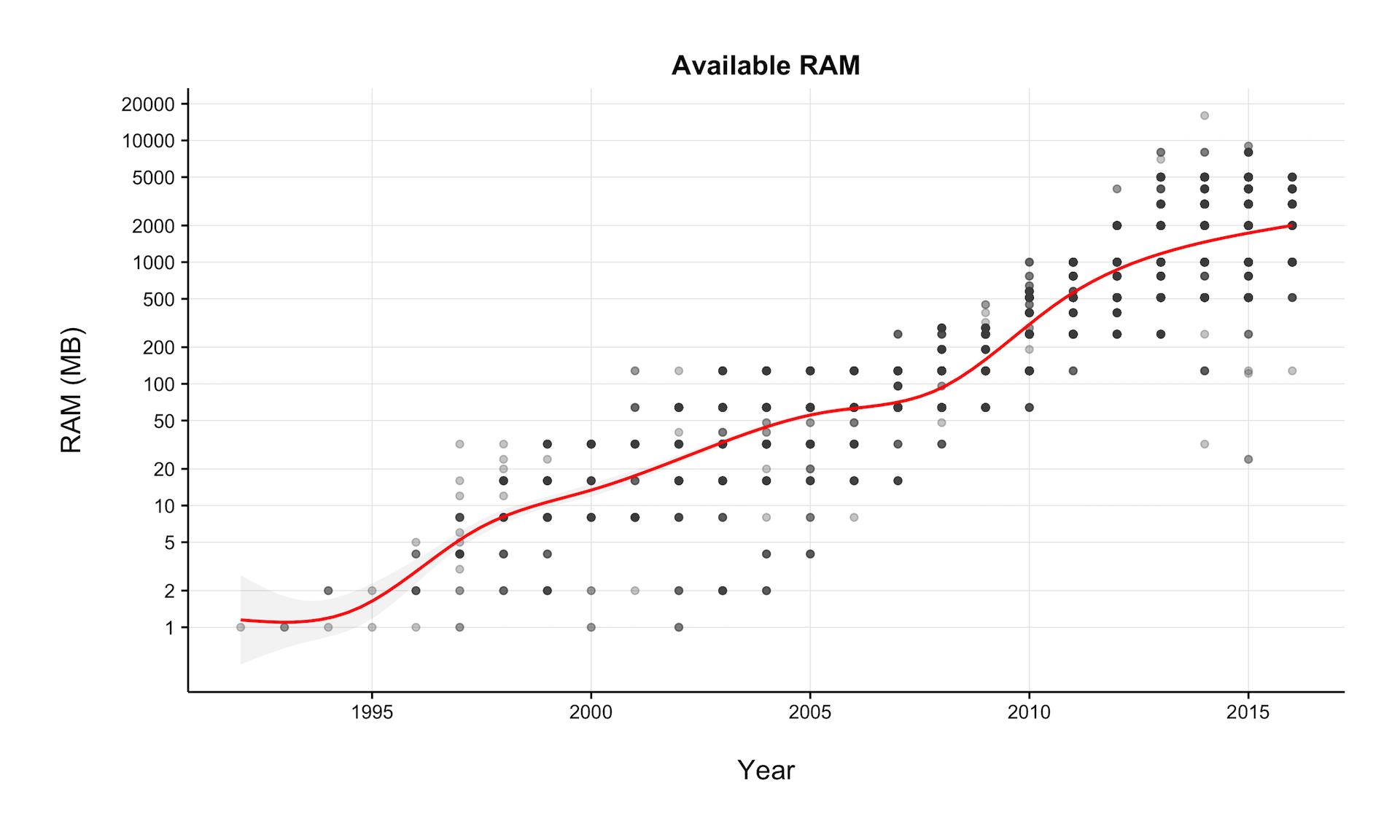
Compressing the y-axis (RAM in MiB) to use a log10 scale gives us a better sense of how drastic the increase has been.
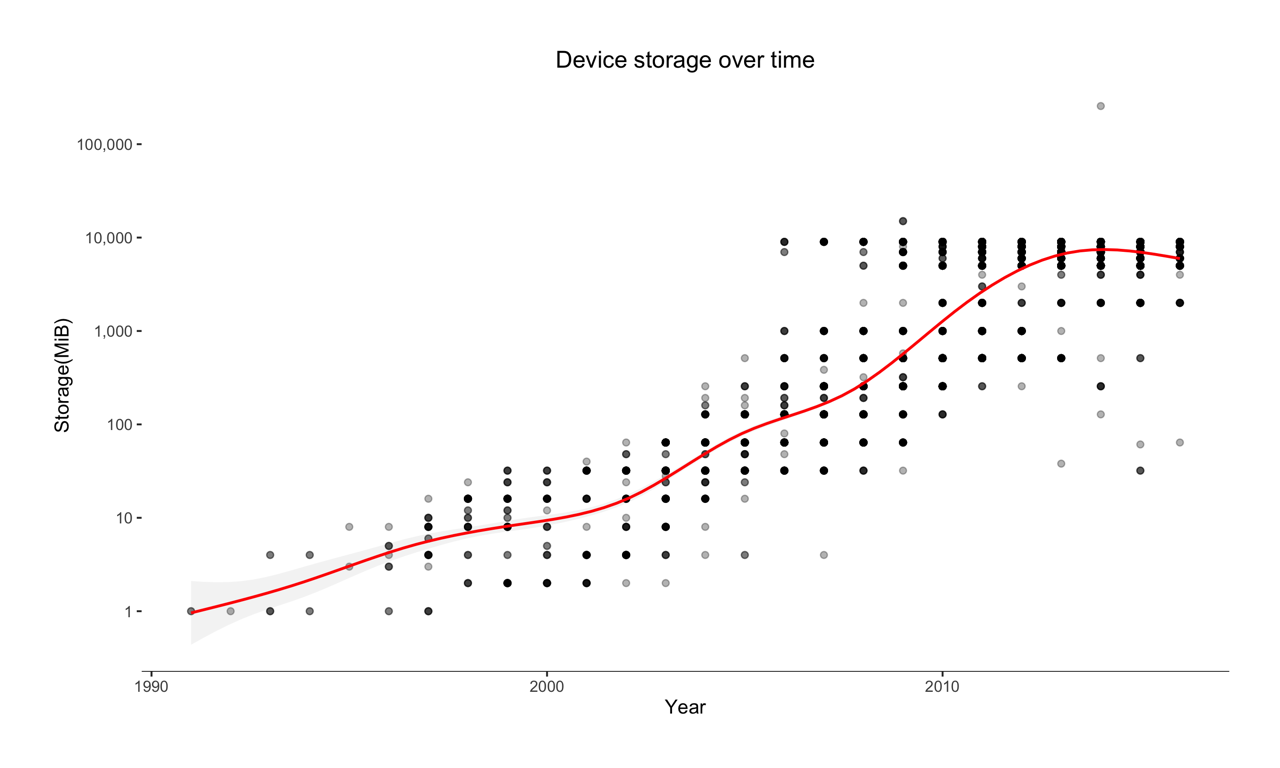
Storage
Similar to the techniques outlined above. I generated a plot of internal storage growth over time.
Clock frequency
Clock frequency refers to the operating frequency of a chip and is often used as one of many indicators of a CPUs ability to quickly process information. It is typically measured in Hertz (Hz).
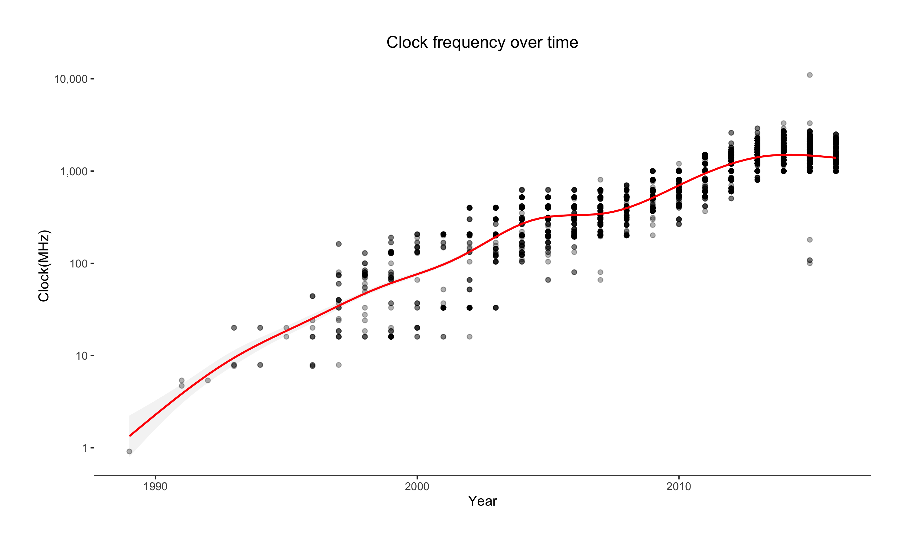
We can see that core frequency has begun to level off, this is likely because of limitations in single core performance that manufacturers are addressing through the use of multiple CPU cores on a single chip.
Pew Research Center: Internet, Science & Tech. (2013). Device Ownership Over Time. [online] Available at: http://www.pewinternet.org/data-trend/mobile/device-ownership/ [Accessed 19 Mar. 2016]. ↩︎
Huawei Nexus 6P - Full phone specifications. (2016). [online] Gsmarena.com. Available at: http://www.gsmarena.com/huawei_nexus_6p-7588.php [Accessed 8 Mar. 2016]. ↩︎
Nokia 9000 Communicator Specs | Technical Datasheet | PDAdb.net. (2016). [online] Pdadb.net. Available at: http://pdadb.net/index.php?m=specs&id=879&c=nokia_9000_communicator [Accessed 8 Mar. 2016]. ↩︎
Unless required by applicable law or agreed to in writing, this Work and the information here is provided on an "AS IS" BASIS, WITHOUT WARRANTIES OR CONDITIONS OF ANY KIND, either express or implied, including, without limitation, any warranties or conditions of TITLE, NON-INFRINGEMENT, MERCHANTABILITY, or FITNESS FOR A PARTICULAR PURPOSE. You are solely responsible for determining the appropriateness of using or redistributing this Work and assume any risks associated with doing so. ↩︎
What is a Netbook? | Lenovo US. (2016). [online] Shop.lenovo.com. Available at: http://shop.lenovo.com/us/en/faqs/laptop-faqs/what-is-a-netbook/ [Accessed 8 Mar. 2016]. ↩︎
Tyson, J. and Coustan, D. (2000). How RAM Works. [online] HowStuffWorks. Available at: http://computer.howstuffworks.com/ram.htm [Accessed 12 Mar. 2016]. ↩︎